
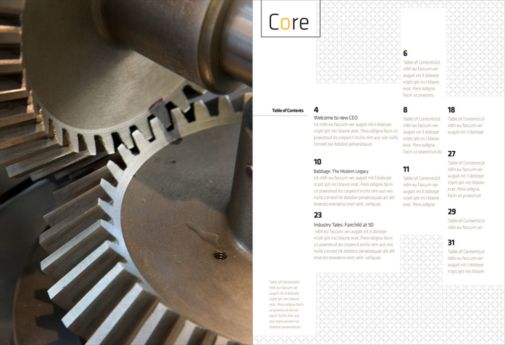
In the summer of 2008, we were asked to redesign Core magazine, an annual magazine published by the Computer History Museum and distributed to Museum members. With the redesign, the team sought to balance the authoritative reputation the Museum enjoyed while also reaching an increasingly younger audience.
We learned a lot about the Museum’s work and perspective as we reviewed previous issues and spoke with key members of the organization. As part of that initial research, we also looked further into the meaning of the magazine’s name: core is a reference to magnetic core, which was the main memory in computers between the ’50s and ’70s, before it was made obsolete by the integrated circuit. As some materials from the Museum explained, “Core memories provided computers with the first random access, high speed, reliable storage. This allowed computers to meet their potential as tools for amplifying the abilities of human beings. Many inventions spurred the Information Revolution, but none with the same profound effect.”
Somewhere along the process, in between sifting through older collateral and reading early drafts of the articles that would appear in that issue, we also learned that the core memory pattern had been used as a logo at one point. This was when the Museum was known as The Computer Museum and first opened to the public in 1984 at Boston’s Museum Wharf. This seemed like quirky trivia at first, but the connection lingered nonetheless.
Core resonated to us more as a messaging opportunity than as a visual device. It is a clear yet evocative term. More than being an artifact reference, it was an important metaphor. It was fitting to work on a publication that focused on recording history but also one that, naturally, took its name from one of the great breakthroughs in the history of recording information.
In the first presentation for the magazine’s new design, we showed five different directions. One of them used the core memory pattern as a deliberate graphic device, one that interacted with grids and columns of type. It was anchored by Klavika, a typeface popular at the time, which had also been used as the foundation for the original Facebook logo.
Another direction sought impact and boldness through scale and use of type. For that study, we used DIN 1451 Engschrift, a typeface we’ve long favored for its crispness and clarity. Its condensed nature allowed for the magazine’s headlines to be graphically prominent.
Among other studies, these two directions became the front-runners. While the core pattern was interesting, it was deemed too chaotic, so we went with the simpler, bolder approach anchored with DIN Engschrift. The line pattern was left behind but, as often occurs with the scraps left behind in any design process, it was stowed away for future rumination.
. . .
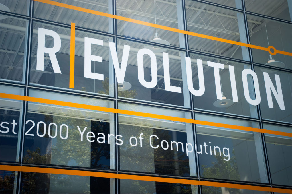
In 2010, the Museum went through a major physical change by opening R/Evolution, a 25,000-square-foot exhibition that completely overhauled their physical space. It also presented an opportunity to rethink the brand. After many discussions as to how big a change that could be, we landed on a subtle refresh for a plethora of reasons. We simplified the symbol and updated to a more contemporary look & feel that was more consistent with the typefaces already employed in the magazine, by then already in our 3rd issue. DIN Engschrift—along with FF DIN—once again helped set the structure for this change.
As part of this brand refresh, we also revised the visual language for all collateral, using the work of photographer Mark Richards to create a simple yet striking system. The combination of those assets—the simple geometry of the logo, the unified typefaces, and Richards’ imagery—served as a foundation for our work with the Museum for years to come.
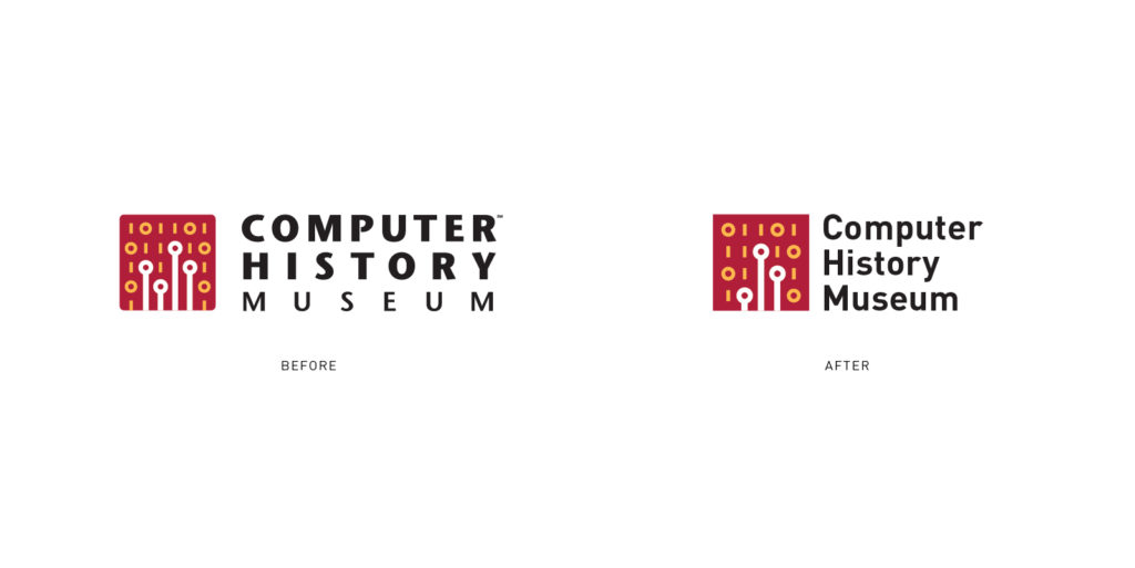
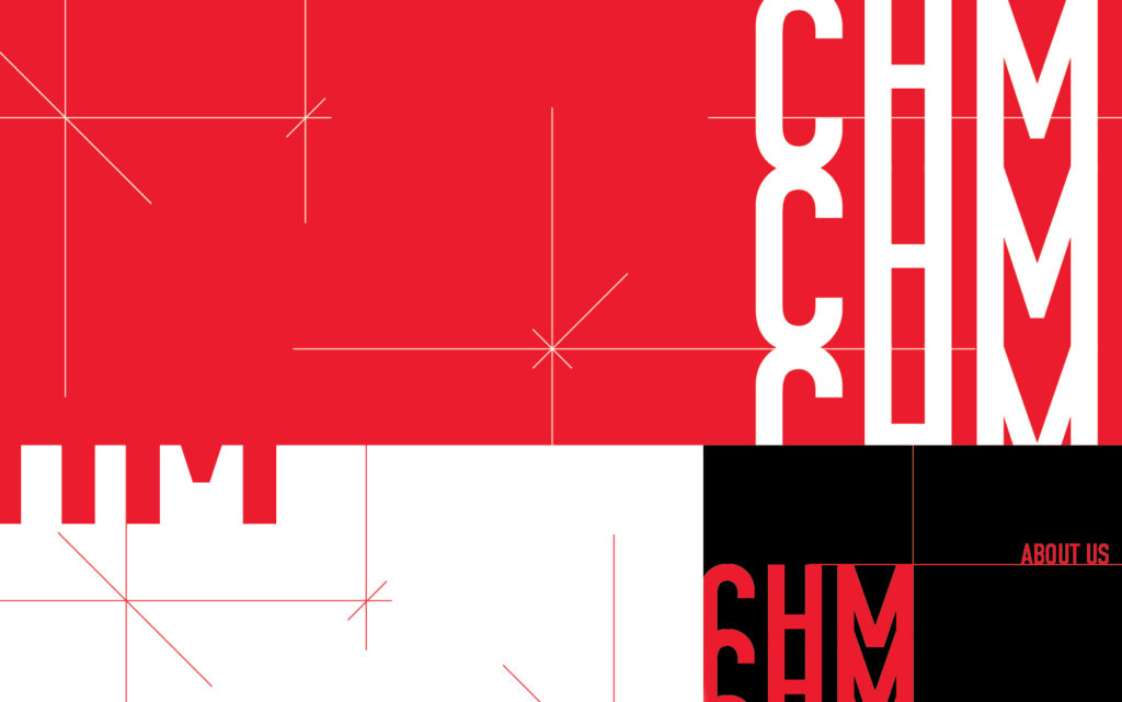
Many changes came to the Museum in 2018—new CEO, new strategy, new perspectives. From a communications standpoint, a decision was made to transition to using the “CHM” acronym more prominently, as opposed to the full “Computer History Museum” name. Those individual words had started to hold back some of the broader ambitions that the new leadership sought to execute. The shift, of course, was not without precedent. Especially in technology, many companies once tethered to what their initials embody—International Business Machines, American Telephone & Telegraph, among others—often face the need to shed those early associations.
In addition to the acronym’s new prominence, we also decided to rethink the Museum’s visual identity, and update it so it could be better suited to work in a digital world and help tell the story that the Museum was more than just a physical building.
Many identity design projects start with the need to balance past and future; heritage and potential. How do you address a long-standing audience while enticing a future audience that has not arrived? It’s a common branding dilemma. How do you tell the story of an established entity as it veers into new domains? Diving further into the process, we made sure that all the options we explored had this balance, seeking to find solutions that would feel both recognizable and new, exploring ways of moving away from physical computing references and towards more flexible signifiers that could be more open to interpretation.
As the process continued and we started to narrow down the options to prepare that first presentation, a few stories kept popping up. With the deconstructed visual components, some wordmarks emerged that explored clusters intertwined and working together, some others veered into seeing how organizational goals might be translated into visuals, others looked at how distinctly separate units could be reconstructed as whole entities. One other option centered on custom typography that echoed the upward trajectory the Museum wanted to express.
We continued shifting and adjusting all possible variables as we went along, evaluating the results: How much familiarity is too “safe”? On the other hand, when does it start to feel too foreign, too much like a different Museum altogether? Should we keep the existing typefaces? The existing color? In designing marks, all this balance must somehow be achieved in a space the size of an iPhone app button—adjusting just one variable requires many internal rounds of subtle iteration.
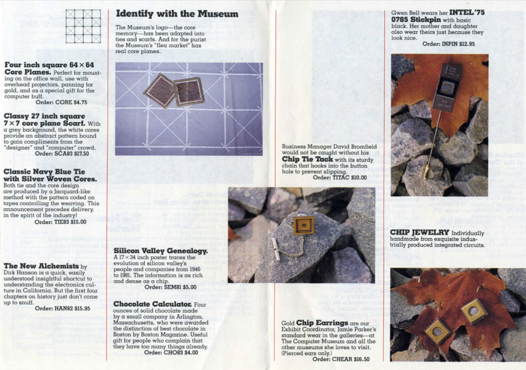
We eventually returned to core memory. As the question was formulated in an internal discussion, and many other similar efforts—what, exactly, is the organization’s core? We remembered that original logo for The Computer Museum and dove back into the archives to get a sense of that long-ago retired visual language. We stumbled onto a lot of older materials, among them a 1982 catalog that advertised some scarves, tiles, and pins but left the pattern rigid and tightly associated with the artifact. We could not envision simply going back to that, but it felt like an intriguing idea to explore.
As we took further liberties with the pattern, a spark started to emerge, and that double meaning was our primary rationale when we presented it. Core continued to be a reference to the recording and documenting, but as it grew past that starting point, it could also be interpreted as growth, as sparks of creativity.
The core grid gained many layers of meaning—it took the museum back to its roots, it acknowledged its heritage but adapted the brand to a digital world that could not have been envisioned thirty years prior, at its initial conception. In a project where it was important both to signal change and to reaffirm identity, this narrative was too difficult to resist. When it was presented to the Museum, they saw it as a network, as a device that stems from a solid foundation but, like roots and branches, eventually reaches far beyond those initial surroundings. A framework that grows far beyond its initial foundation.
As the process developed, the grid started to work better as a stand-alone component. Its lines were too thin to be attached to the main logo; its connotations became too open to interpretation, its fluidity became too hard to contain. It was eventually developed mostly as a visual language that could support the new direction without being front and center.
After a few rounds of iteration, we returned to the foundation, to the core. In this case, this meant going back to the system we had already built, a visual language rooted in boldness, clarity, and simplicity—the very same elements we now needed to reaffirm as the Museum shifted strategies. We returned to DIN Engschrift, which had been there all along. A typeface whose origins date back to 1905 was there once again to provide the robust scaffolding to the idea, with the core pattern bouncing off its structure, breathing new life to a system that now seems obvious only in hindsight.
As this work starts to get rolled out, the system aligns with where CHM stands today—an authoritative institution deeply grounded in history, but one that aims to surpass its original intent, one that actively seeks to find new connections and grow far beyond its walls.
This remains very much front of mind as we continue this work. An idea that started as simple line patterns and crisp letterforms has now started to grow and expand into a broader network, a fluid intersection of things already built and others yet to come.