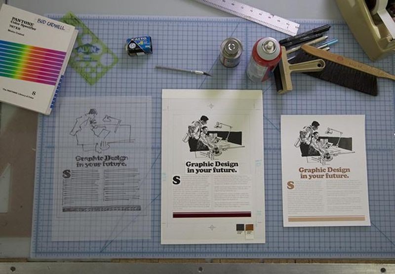

It’s been roughly 30 years since the desktop computer revolutionized the way the graphic design industry works. For decades before that, it was the hands of industrious workers and various ingenious machines and tools that brought type and image together on meticulously prepared paste-up boards, before they were sent to the printer. “Graphic Means: A History of Graphic Design Production” explores graphic design production of the 1950s through the 1990s—from linecaster to photocomposition, and from paste-up to PDF.
I caught up with graphic designer and film director Briar Levit to get the inside scoop behind the making of Graphic Means.
This interview was conducted in conjunction with the film screening of “Graphic Means” on October 13, 2017, at the Computer History Museum.

Designer and filmmaker Briar Levit. Photo by Nathan Wallace.
Lauren Miyamoto: How were you first exposed to graphic design? Were you always interested in art and design as a kid?
Briar Levit: I definitely drew as a kid, and took photos. I did a lot of black-and-white photography in high school, which laid a good foundation for my understanding of composition and the power of images.
I actually started studying design because I wanted to design exhibitions—science and history exhibitions to be specific. In the process, I fell in love with just the graphic side of exhibition design and eventually realized I preferred the intimacy of books as designed objects. I still love museums though.
LM: What were some of the first digital tools you used for graphic design?
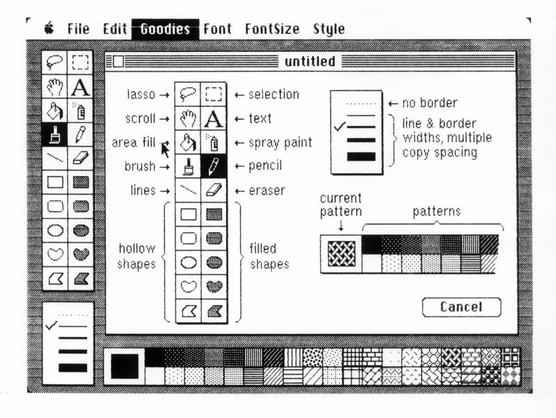
BL: The first digital tool I used was a Mac Classic. My dad had gotten it for us. I remember playing with MacPaint, and making some cards for family. I started studying graphic design in 1996, and my college, San Francisco State, had already made the switch to digital design techniques. I bought a computer in my second year—a PowerPC G3 (beige).
LM: How has your work and approach to graphic design changed with the evolution of technology? What technologies have had the greatest impact on your own career?
BL: If anything, I’ve been trying to slow down my design process a bit as a response to making this film. It’s important not to get caught up with the distractions of selecting colors, typefaces, textures, etc., when you’re at the start of a project and just trying to come up with ideas. I’m a strong believer in starting with a writing implement (analog pencil or Apple pencil), that allows you to just sketch the ideas as they come and doesn’t tempt you to get distracted by the details that design software offers. I’m by no means a technophobe—I love my computer. But I do think there is a speed at which we are working that is leading to less deliberately considered work.

Window of the original MacPaint, ca.1984. Collection of the Computer History Museum, 102626977.
LM: What inspired you to produce Graphic Means? Where did the idea for the film come from?
BL: I missed the Cold Type Era myself, but I saw elements of it in my early career. There were tools on shelves in studios that were collecting dust. Or I was required by one art director to print out a design digitally and then hand write all the specifications on that sheet to give to the printer (a redundant thing to do). So I was always aware of this way of working that I had missed, but I didn’t really know much.
The thing that really started the Graphic Means project is my tendency to spend a lot of time at the Goodwill. I get so many good books there. I usually look for cover designs I like or overall book designs that are inspiring and that I can share with my own design students. But I also found myself amassing a collection of obsolete graphic design production manuals starting in 2013 or so. I just liked looking at the step-by-step illustrations and photos showing processes that just blew my mind in terms of the kind of skill one would need to do them well—things like making comps for clients with colored markers or making a paste-up mechanical.
So I shared this collection with some of the younger designers in my shared studio space, and they had no clue about these methods—or even less than I did, I should say. But they were also really interested. I thought this is something I have to share with my students. That was the obvious thing to do. But the topic kept gnawing at me. I told colleagues who were my age (late 30s) about it, and they admitted they knew very little as well but were curious. I figured I would make a book about it—I’m a book designer after all. But then I remembered my experience watching Linotype: In Search of the Eighth Wonder of the World. This film about one machine had blown the lid off my simple understanding of typesetting. It was also a film directed by a graphic designer. I thought, if Doug Wilson can do it, maybe I can? And once I considered doing for the Cold Type Era, what Wilson had done for the automated Hot Type Era, I couldn’t let go, and off I went.
LM: What is the most surprising or interesting thing you learned directing Graphic Means?
BL: I have to say, I was really amazed that photo typesetting required coding. I saw an old promotional video from the 1980s for London College of Printing (now London College of Communication), and that was the first time I saw people entering code on a very crude screen in order to set type. I had no idea.

Designer and educator Cece Cutsforth’s paste-up as demonstrated in Graphic Means. Used with permission.
LM: How did you incorporate your design work and experience into the film?
BL: I spent a good deal of time working as the art director for feminist pop culture magazine Bitch. When you see the film, you’ll see that there are parts of the film that are definitely approached through a feminist lens.
As for my experience, I definitely asked interviewees questions that were based in my own concerns about how we work with digital technology now. And these are things I’m trying to address with my students early on, so they don’t have to unlearn things.
LM: You currently teach typography and studio design at Portland State—how do you incorporate technology into what you’re teaching your students? How much of what you teach is based on some of the early methods featured in Graphic Means?
BL: Students begin working with computers very early on in our program at Portland State University. I’ve always tried to make the early process in a project happen on paper with a pencil or pen. I can’t always control that—but since making Graphic Means, I’ve come up with some approaches (including learning to kern with dry transfer type) that I think will help students slow down and really think about their ideas, and also the details of their type. As far as techniques used in the pre-digital era, there are not many that are required in our program, or any for that matter, these days. That said, there is a massive movement of folks who are looking to intermix their digital creative work with analog work. The letterpress community continues to grow. There are innumerable hand-lettering groups popping up all over the world. I don’t think anyone would abandon their computer, but approaching the design process with a moderate amount of both analog and digital approaches can lead to some incredible results.