
Almost from the moment it was introduced, Apple’s Macintosh computer system was adopted by graphic artists. Perhaps it was the easy-to-use graphical user interface (GUI), or the programs, such as MacPaint and MacDraw, which allowed artists to so freely adopt the machine to their work. Sales were brisk and, a little over a year after the Mac’s introduction, a pioneering comic book was created.
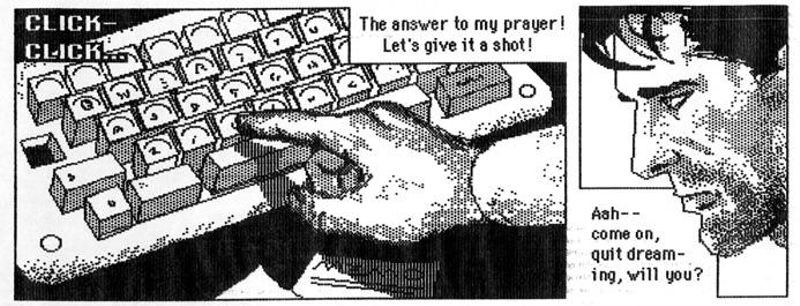
A panel from Shatter Special Number 1, drawn by Mike Saenz
Traditional methods of creating art for a comic book hadn’t changed much for 50 years; a detailed and step by step process:
As with many fields, this has been changed almost completely by the introduction of the computer.
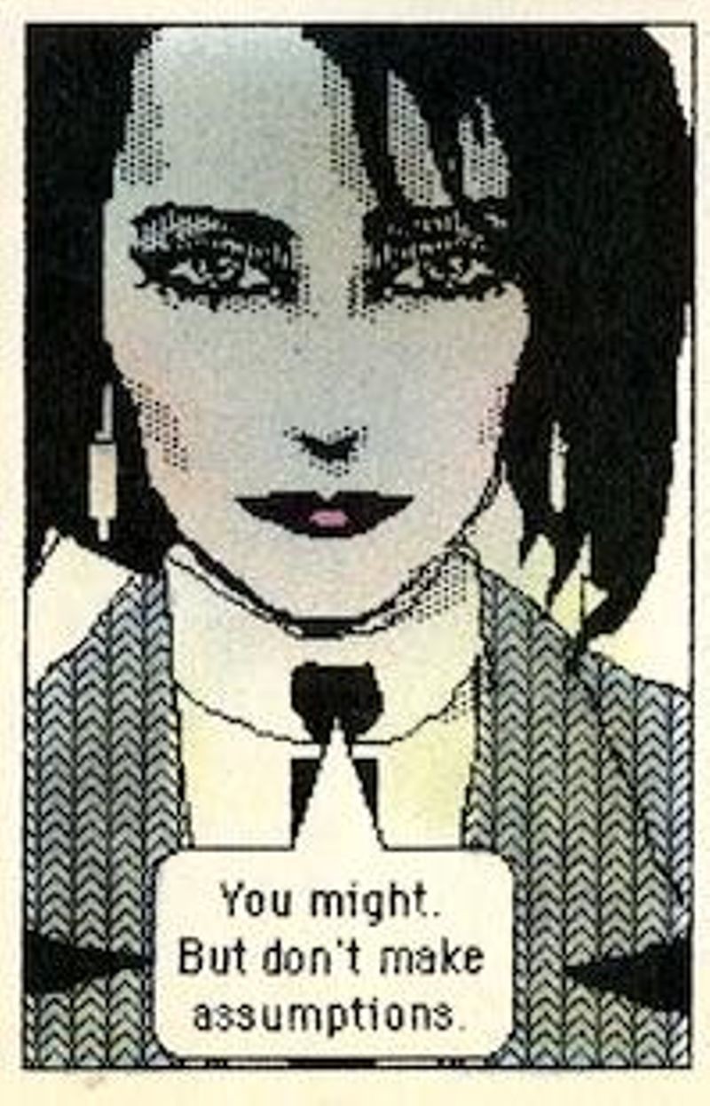
The art was created on a Mac-Plus, but colored by hand.
Probably the first significant comic book to use art created on a computer was First Comic’s Shatter. Created by writer Peter B. Gillis and artist Mike Saenz, Shatter was the story of a cop named Sadr al-Din Morales, aka Shatter. He is tracking down the killer of board members of Simon Shuster Jovanovich, a company that turns out to be performing experiments transferring skill sets between people using RNA. The storyline is very much in-line with works like Ridley Scott’s Blade Runner and the early works of William Gibson and Bruce Sterling. Threads of the story, such as distrust of corporations, the Film Noir feel of the project, and especially the artwork, would place it firmly in the genre of ‘cyberpunk.’
The process of creating the art may actually be the most important aspect of Shatter. Editor Mike Gold spoke about the creation process in an editorial for the first issue “When [writer Peter Gillis] pitched the concept of Shatter, he did so in terms that were integral with the Macintosh – the series was created to be drawn on the Mac.”
It all started with a series of rough pencils for each page. These were used to get sign-off from the editors of the comic. Once Saenz had done that, he started from scratch on the art using a MacPlus computer and the MacPaint program. The system he used had 1MB of RAM, a built-in floppy disk drive as well as an external floppy disk drive. Saenz had to use the Mac’s mouse to create the art, as they had no scanner to capture drawn art. He had to work on each page in sections as the Mac could only display portions of a page at a time. Saenz used the Mac to do all the lettering. Then, after the art was created, it was printed using an ImageWriter dot-matrix printer. This art was then colored in the traditional way, as the Macintosh was strictly a black-and-white machine at the time, and then photographed like traditional comic art would be.
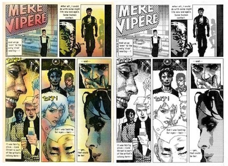
Side-by-side comparison of a Shatter page – Finished, colored work on the left, a black and white tearsheet on the right.
”…we agreed that every aspect of Shatter would be performed on the Mac – the art, the lettering, the logo, the advertising, even this editorial,” noted Gold in Shatter Special #1, “Everything but the color.”
This method only lasted for two issues. Saenz left the project and First Comics hired Steve Erwin, Bob Dienethal, and Rick Oliver to create the art for Shatter. They took a different route, creating the art in the traditional way, then scanning it into the Mac. After issue 7, Charlie Athanas took over the art duties, returning to creating the art directly on the MacPlus, though he eventually went to using a tablet and stylus instead of a mouse for the drawing. He also upgraded from MacPaint to another Macintosh drawing program called Fullpaint. He remained with Shatter until issue 14, when the comic was finally cancelled.
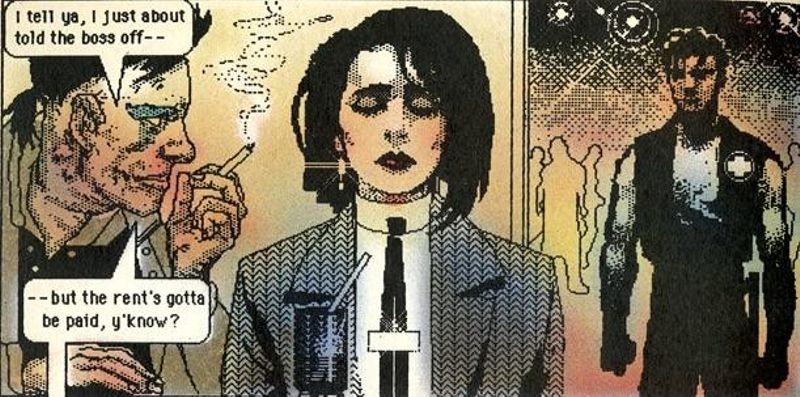
Shatter ran from 1985 to 1988.
“The hardest part was not drawing with the big clunky mouse that came with the MacPlus.” Athanas said on his Burning City, Inc. site (www.burningcity.com), “Nor was it the complete lack of memory, which meant that you had the drawing program (Fullpaint) on a floppy in the main drive slot, your 800K work disk floppy in the external drive, and you had to swap out disks to use any stock art that you had created. No, the hard part was the fact that you could only see about two thirds of a full page at any one time, unless you shrunk it to a postage stamp size thumbnail. Covers and splash pages, especially double-page splash pages, were a layout nightmare.”
The artwork for Shatter as seen through the lens of today’s comic fans may seem a bit primitive. Many of the images seem pixelated and there is a stiff unreality to the characters. Saenz created a toolbox of images that he could insert and tweak to fit the role, lessening his time in creating scenes where objects repeatedly appeared. Readers who remember the Macintosh systems of the 1980s will instantly recognize the fonts and artistic embellishments used in Shatter, and they may seem a bit gimmicky today, though at the time were revolutionary in the comic field.
“One thing that was clear from the beginning is how the creators saw this as merely a first step. “All this is extremely exciting,” said editor Mike Gold, “It’s fun to be a trailblazer. And the real fun is, as software writers create bigger and better graphics programs for the Macintosh, we’ll be able to create even more unusual and more interesting Shatter stories.”
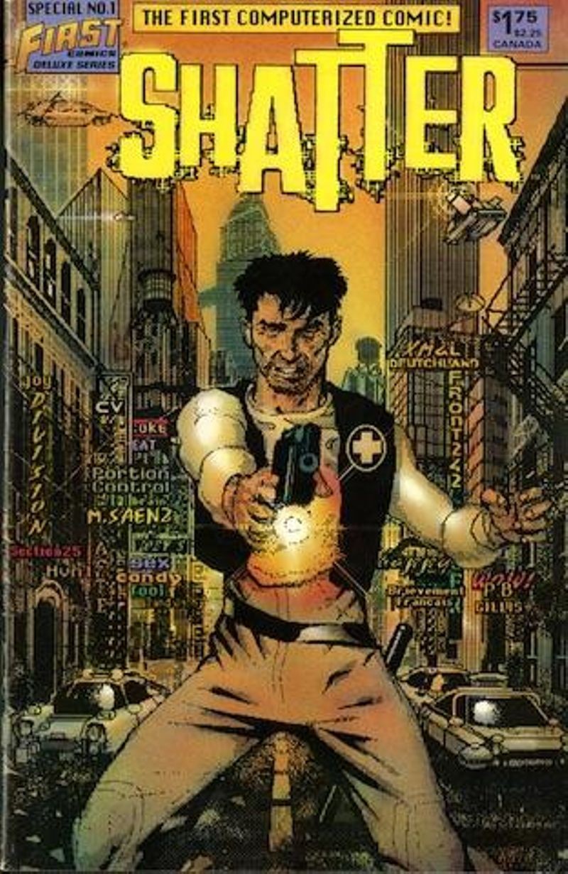
Cover for Shatter special number 1, 1985
After leaving Shatter, Saenz created a program called ComicWorks. He didn’t stop working on comic books, though, and created Iron Man: Crash, probably the first computer-created graphic novel from a major comics publisher, Marvel Comics. In 1993, he would create Donna Matrix, a graphic novel using 3D graphics. Pepe Moreno’s 1990 graphic novel, Batman: Digital Justice, brought DC comics into the computer-generated world. Since then, the use of computers to create, and later to distribute, comics has expanded to the point where nearly every comic uses a computer as a part of the creation process. In many ways, the way Saenz and Athanas created their art is exactly the opposite of how most comics are created today. Nowadays, art is created on traditional comic boards, then scanned into the computer for coloring. Most lettering today is done by various computer programs.
The first issue of Shatter sold all 60,000 copies, though sales slipped after that. Today, it is seen as a significant milestone in the way comics are produced and an excellent example of early cyberpunk comics. The Computer History Museum has had a copy in the collection since 1985, kindly donated by Rick Oliver, along with several un-colored tearsheets from the Special Issue Number 1. The collected Shatter may well stand as one of the best examples of what the Macintosh could do for artists in 1985… even if everything feels a little blocky to today’s readers.